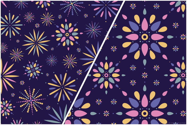
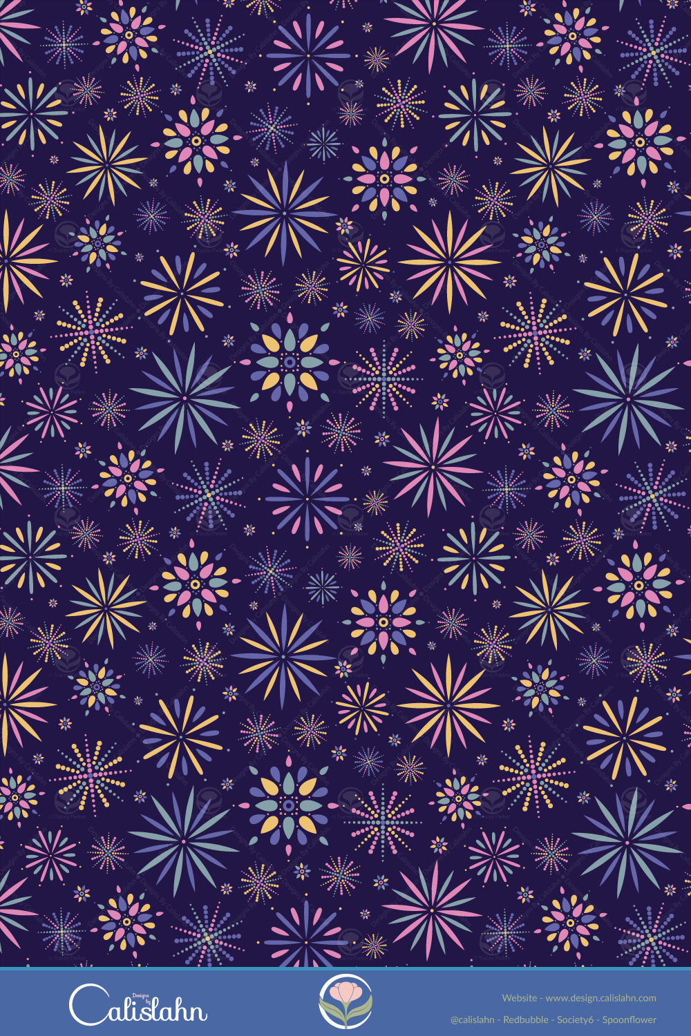
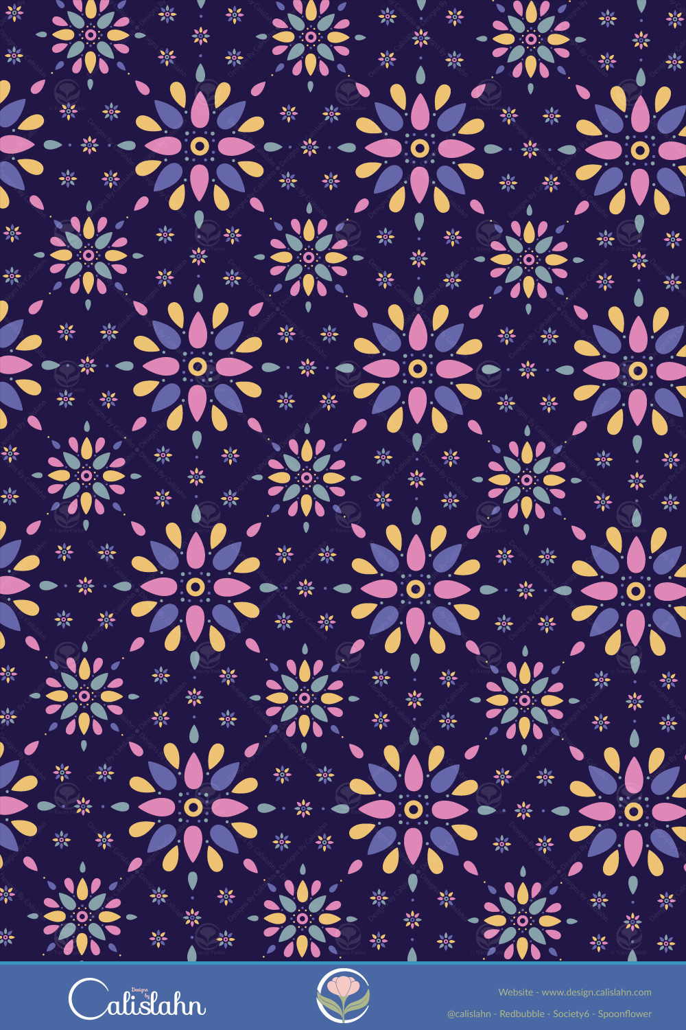
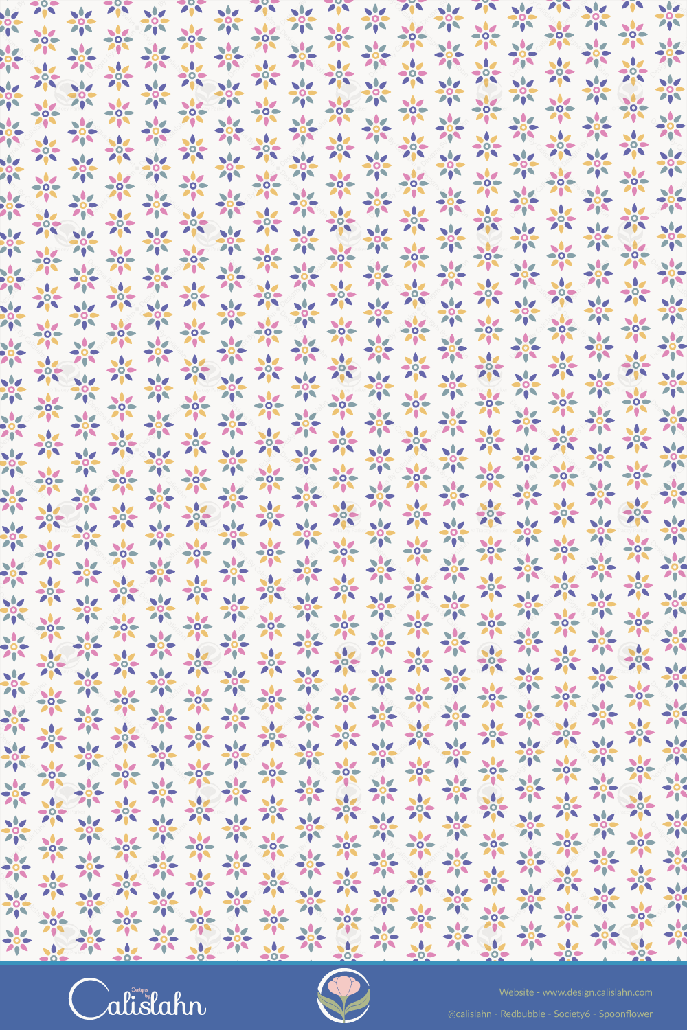
Choosing colour palettes is still an indecisive struggle for me at times so I love it when I discover sites like Pantone Connect and Khroma, for this collection of patterns I used colours from Pantones trending selection, including the colour of the year Veri Peri.
Shop These Designs
The links below will take you to all available products for each colour option at my stores.


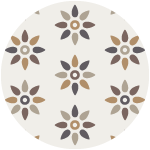
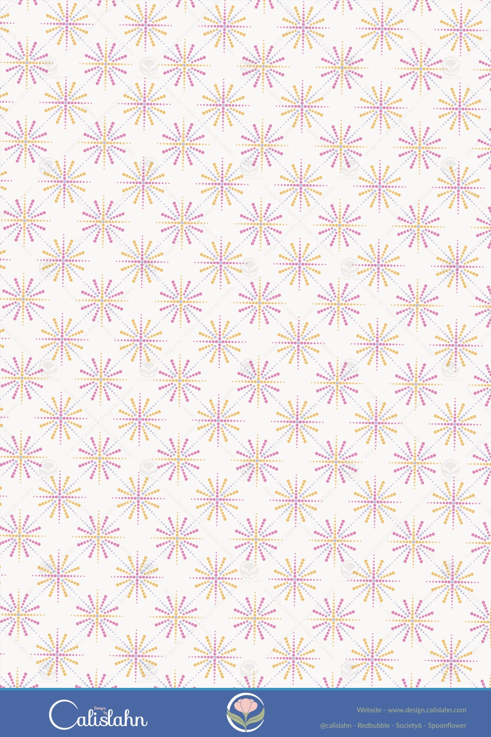
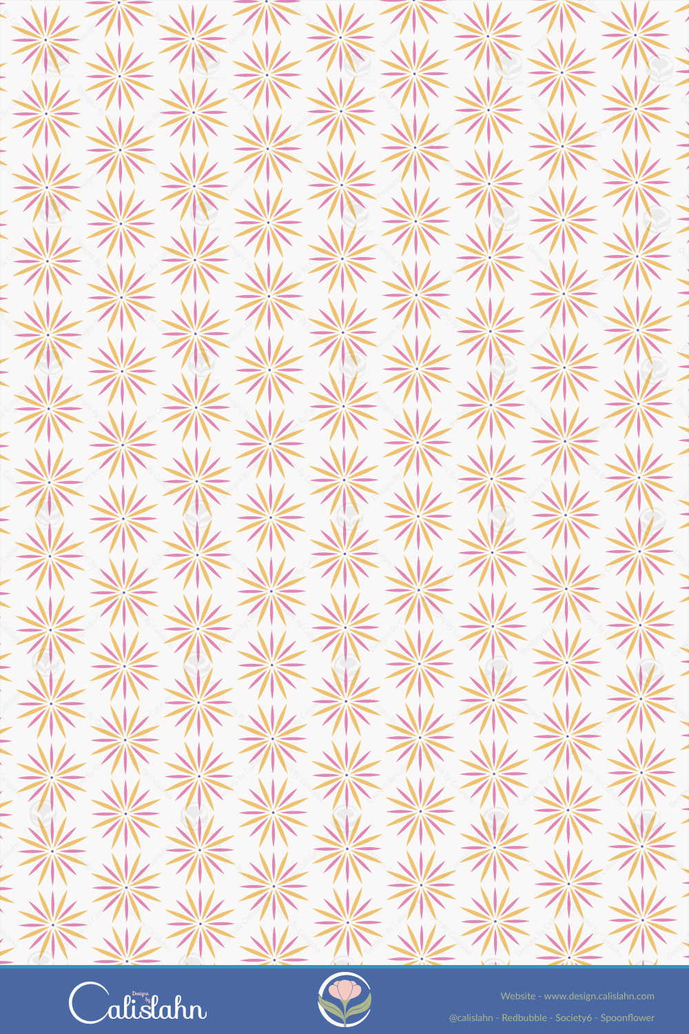
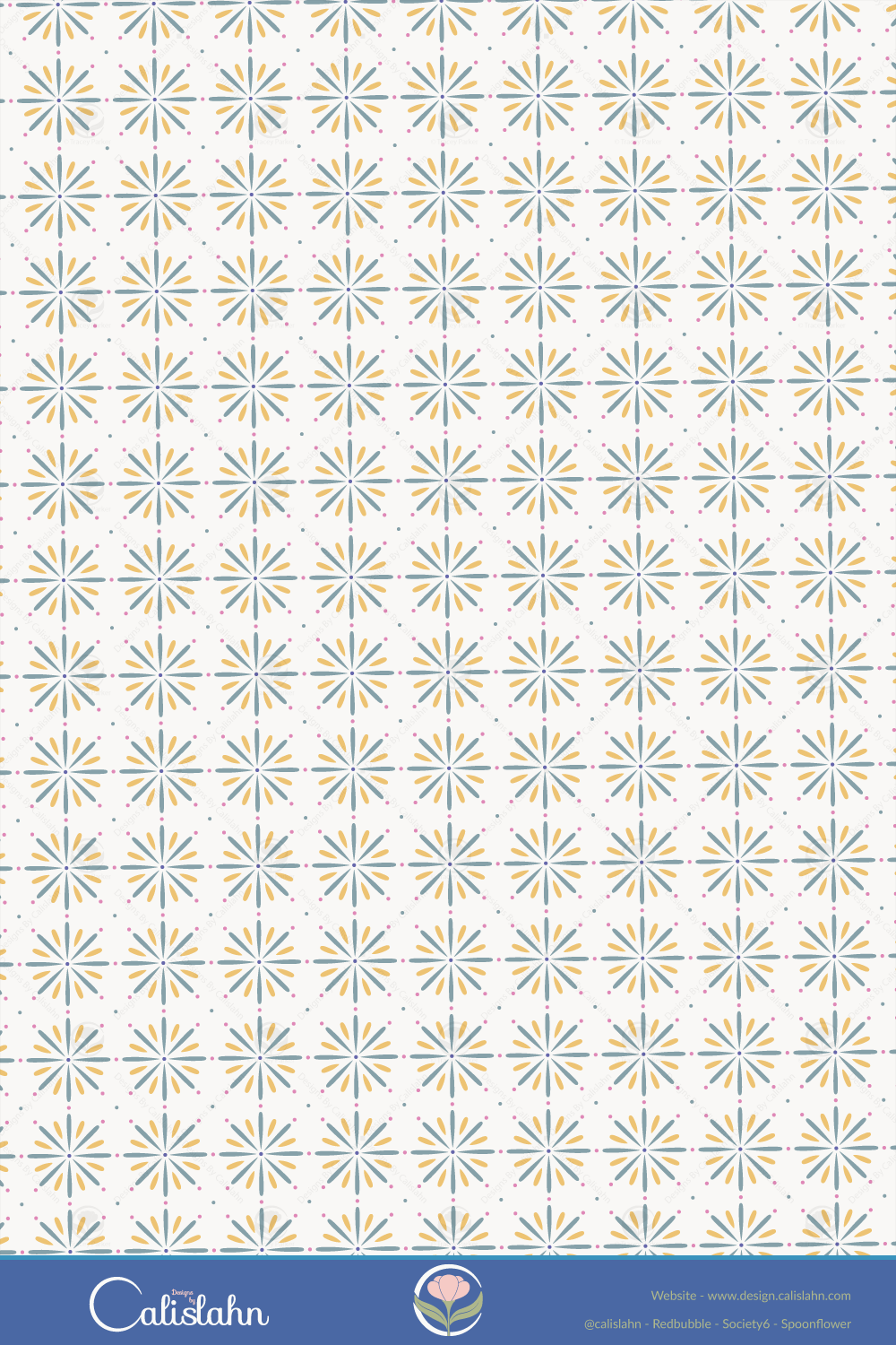
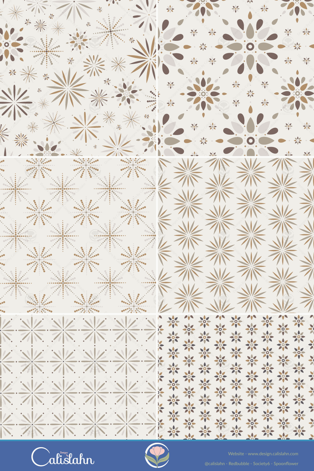
I love how vibrant the colours look on a dark background, yet also good on a lighter one. For Print-on-Demand I also made a more neutral version of each pattern, also using colours from Pantone Connect.
A New Look
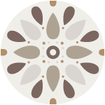
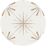
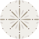
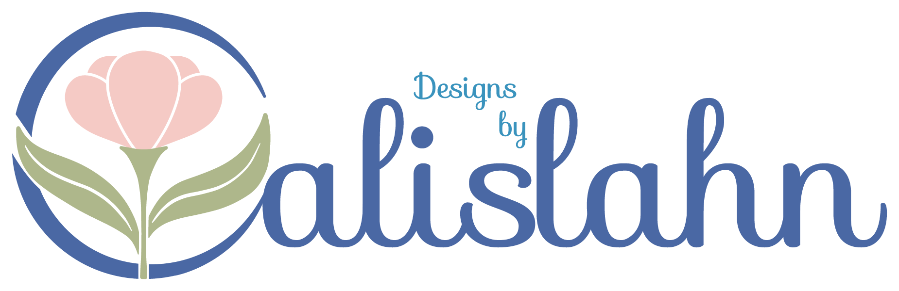
When I first learnt how to make vectors I created a rabbit shape from a circle and I have used it as my avatar/icon ever since but it has no relation to what I actually create, which is mostly botanicals.
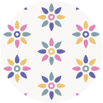
And being a new year it seemed like a good time for a rebrand, I have been pondering this for a while now and had a few vague ideas but after watching some classes about branding on skillshare my ideas started to come together in the above icon.
So now I came once more to the sticking point, colours.
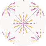
My first instinct was to look on Pinterest and this led me to a graphic design blog post where they mentioned Khroma, it’s an interesting site that after choosing 100 colours from the long list creates palettes based on your colour preferences.
My favourite colour is blue and it showed in my results, but I also lean towards teals, purples, peach, pinks and greens, I think looking back over my patterns as a whole this becomes obvious.
Scrolling through the palette tab I came across one that was a perfect mix of some of my favourites, after adding in an off white tone I had my new brand palette.
I also updated my shop banners at my print-on-demand stores, Redbubble gives you a template for it and Spoonflower tells you the precise sizing, Society6 on the other hand says make it 1000 x 100 pixels but then it crops the height and upscales the image on widescreen monitors making it look blurry, it would be better if they asked for it larger then downsized it but after much fiddling I at least stopped my text getting cropped, although it is smaller than I would have liked.
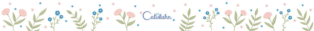
On my iPad it looks just like this, no cropping or upscaling so it seems to mainly be a widescreen issue.
Post updated November 2022 to add direct links to available print-on-demand products.